Vendor Management Office
Uncovering opportunities to elevate & re-design the vendor serviceS
and experienceS in the supply chain space through qualitative research
August - November, 2023
The new Vendor Management Office is seeking to partner with the Design team to enhance and elevate the Vendor Finance portal experience in order to make a positive impact in the Vendor space.
The VMO team is aware of current, negative feedback shared by vendors and the Customer Solution Center end-user associates in relation to the RBS Finance CSC Portal tool experience and are looking to address them. The teams’ priority is to demonstrate their commitment to vendors and maintain a healthy partnership with them by listening, understanding, and then leveraging this information to prioritize their improvement strategies and solutions
My Role
• Scope, plan and orchestrate the engagement from beginning to end
• Lead designer planning and driving the user research, interviews, and heuristic evaluation
• Synthesize data points collected into actionable insights
• Translate data collected into user journeys, workflows and design recommendations for our stakeholder to implement
• Maintain a close relationship with stakeholders prioritizing communication and alignment
• Mentor and support peer Jr. Designer, Ben
THE APPROACH
USER EXPERIENCE (UX) + USER INTERFACE (UI) RESEARCH & EXPERIENCE DISCOVERY
Context Immersion
Before jumping into interviewing, it was key for us to have an understanding of the platform vendors and associates were using and the features available to them.
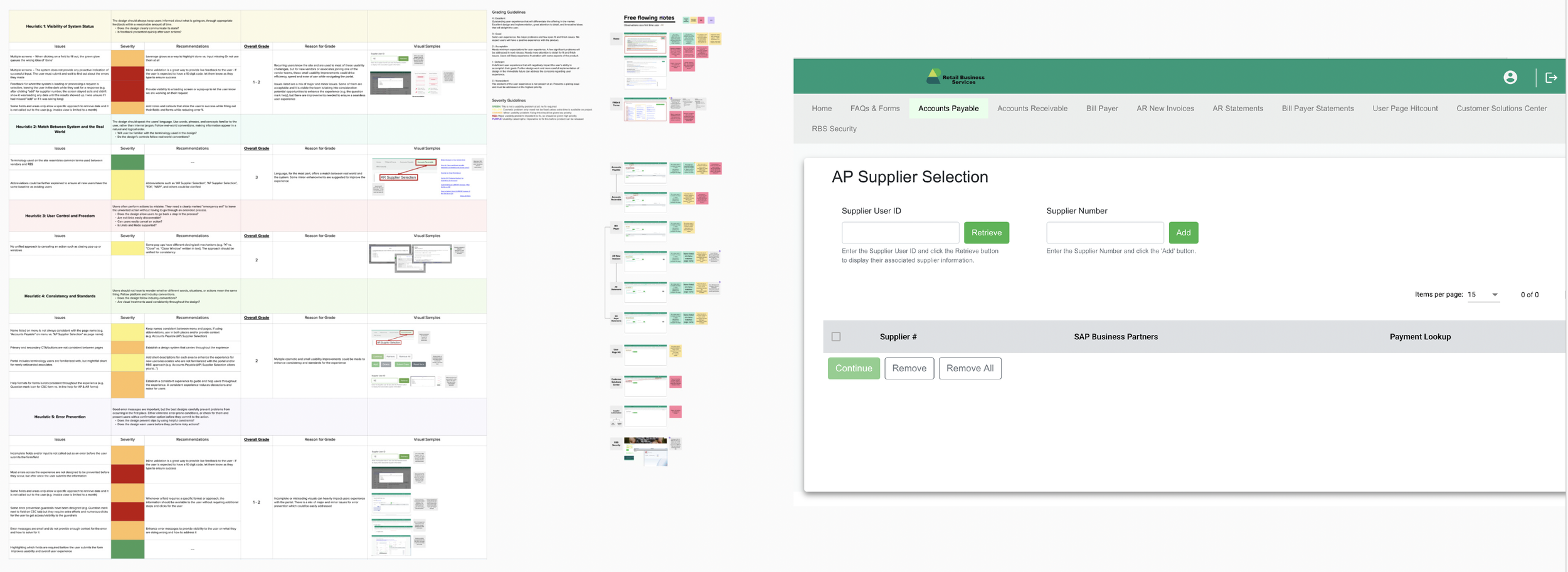
We conducted a heuristic evaluation to understand, firsthand, the challenges and pain points that could take place while navigating the platform. Once the heuristic was completed, we requested a demo of the platform to compare the expected experience with ours.
Empathize
We partnered closely with our VMO stakeholders to identify 12 research participants including vendors and internal CSC portal associates who could speak to the experience, challenges and pain points faced while performing every day tasks on the platform.
We created two different discussion guides based on the users and their responsibilities. The discussion guide was shared with the stakeholder to ensure alignment and get their approval before conducting the interviews.
Interviews were schedule as 1:1 conversations with each interviewee identified by our stakeholders for 45 minutes via Teams.
Key Themes
As we synthesized the data, we were able to identify key themes overlapping across users.
One of our key findings was that vendors have fixed patterns and expectations based on what they’ve experienced by engaging with other retailers. When they engage with our portal, they expect the features to match the experiences they’ve had with retailers like Amazon, Walmart, and Target.
Most UX & UI related pain points highlighted by vendors were features that didn’t match their system expectations such as extensive search capabilities, account access, downloading receipts and forms in bulk, and availability of FAQ, support materials and similar.
Breaking Point
Framing the opportunity beyond “just” UX & UI as originally intended by the stakeholders.
Our new opportunity: The Vendor portal as a service and a experience
While we were planning our discussion guide for the interviews, our stakeholders requested we ignored the “Customer Solution Center” tab available at the top menu of the portal. They were aware the experience was sub-par, but didn’t want to focus this research on this tab.
After the first vendor interview, we realized it was CRUCIAL to collect data around the CSC tab as the interviewees kept referring to it as a major pain point impacting their overall experience with the portal. With this information, we went back to our stakeholders and pushed back to include the CSC as a key element of the research scope.
This push back and decision completely changed the information we were able to collect and drove higher impact delivery for our stakeholders. By collecting information about the experience with the portal itself and the CSC tab (used to report issues with the portal) we were able to map the experience appropriately and craft recommendations to address the UX and UI of the portal AND the processes established behind the scenes to support the vendors.
Prioritization
We created a prioritization diagram to illustrate the pain points from most to least severe, dividing them into portal overall enhancements vs. CSC tab specific.
We also divided pain points and opportunities into two key buckets. The blue bucket represents improvements focused on the UX/UI (how it works and how it looks) vs. the orange bucket that represents the process improvements necessary in the backstage to better support the vendor experience.
Output
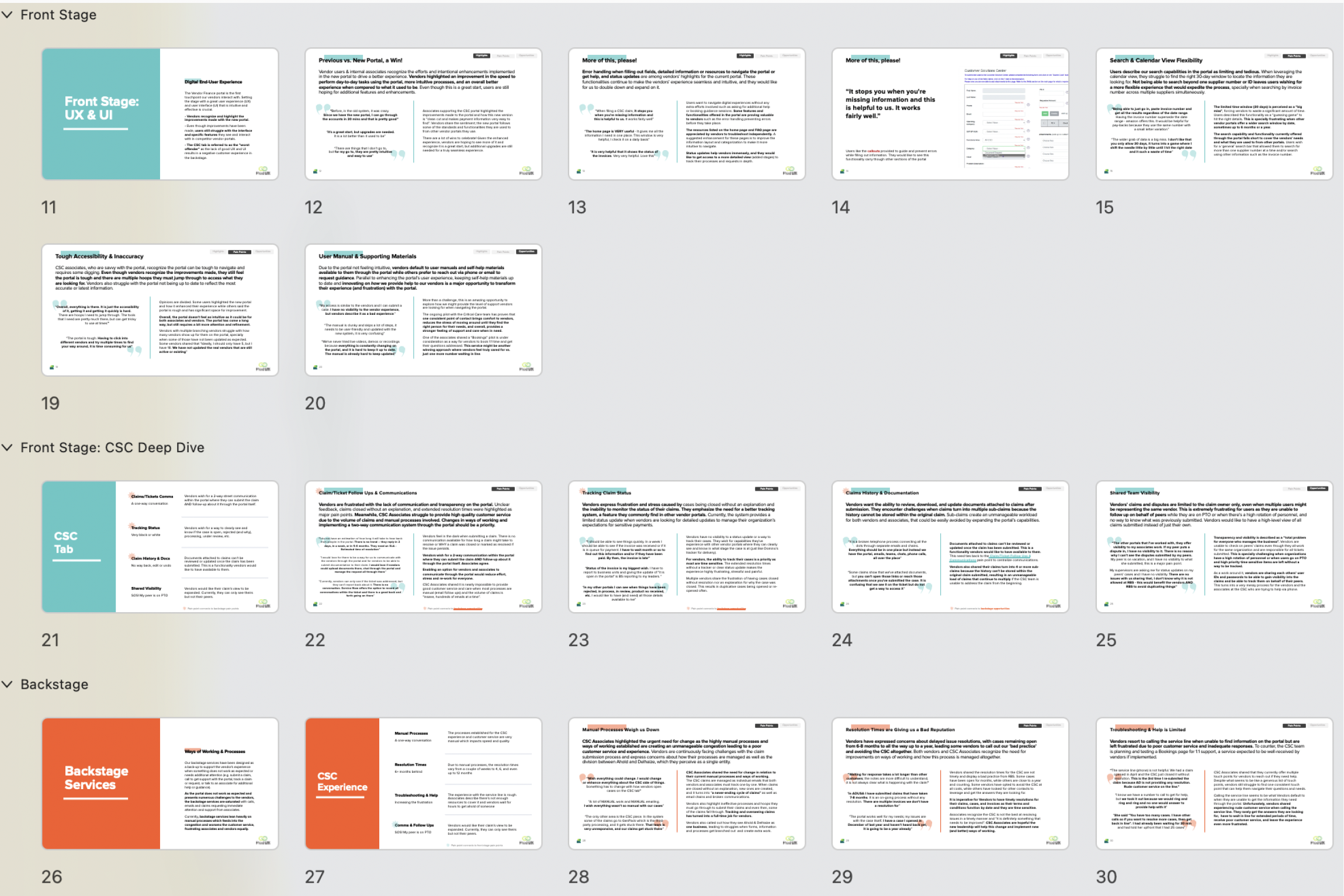
Our output was a UX Research deck providing a comprehensive overview of our findings and process as a whole. We decided on a deck because the document was going to be handed off to an Agile team to implement and had to live beyond us.
Content:
• UX Research process explained
• Highlights for the experience
• User journeys identified
• Heuristic evaluation
• Pain point prioritization
• Deep dive into each pain point highlighting direct quotes from the interviews
Outcomes & Achievements
Business goal achieved
We received overwhelming positive feedback for the initiative. Vendors were extremely appreciative of the opportunity to share their experience, challenges and pain points with us. It made them feel heard, valued and cared for.
Validation for next steps
The Critical Care team and pilot is transforming vendors experience. Those who have experienced it described it as a “TREMENDOUS” help and emphasized how much they value it.
Stakeholders delighted
& informed
“It is so good to see it this granular. We knew it was bad, but I love seeing the data points that bubbled
up because I can now have discussions with IT backed with data”
“I can’t believe users said that about the phone experience. I had no idea vendors were having a bad experience with the service line via phone. This was eye-opening”
“This is so reassuring. I’m shocked in a good way and encouraged. Having this information available
to us is amazing and will inform our future strategy”


